Enterprise teams rarely compromise creative quality because they lack ideas. More often, quality erodes when an urgent launch forces designers, developers, marketers and approvers to revisit the same low-value decisions across every page, channel and sprint. A button state changes in one workflow but not another. A campaign landing page introduces a new type scale without a clear rationale. Accessibility checks arrive after the visual direction is already approved.
This is the pressure that makes enterprise design systems valuable. A well-governed system does not tell creative teams what every experience should look like. It makes repeatable decisions faster and more reliable, so people can spend their judgement on the moments that actually differentiate a brand: the campaign idea, the narrative, the visual concept and the customer interaction.
The false trade-off between consistency and originality
Myth: a design system makes every experience look the same.
Fact: a design system makes the recurring parts of an experience coherent, freeing teams to make distinctive choices where they matter. Nielsen Norman Group defines a design system as a collection of reusable components, guided by clear standards, that can be assembled to build digital products. Its value lies in helping teams create interfaces with greater consistency and efficiency, not in replacing design judgement.
The practical distinction is simple: standardise what customers need to recognise and use repeatedly; design deliberately where the brand needs to make a new point.
Decide what to reuse and what to explore
The most useful enterprise design systems are not large catalogues assembled for their own sake. They are decision systems. They distinguish between choices that should be resolved once and governed centrally, and choices that deserve fresh creative exploration for a specific audience, moment or proposition.
| Decision area | Best handled as a governed, reusable foundation | Best handled as bespoke creative expression |
|---|---|---|
| Brand foundations | Colour tokens, typography roles, spacing scale, logo use and contrast rules | Campaign art direction, image treatment, launch-specific illustration and editorial tone |
| Components | Buttons, forms, navigation, cards, alerts, modals and error states | A signature interactive feature or storytelling module that supports a specific campaign idea |
| Interaction patterns | Keyboard behaviour, focus order, validation, loading and empty states | Motion, transitions and micro-interactions that create a purposeful emotional response |
| Content patterns | Page templates, headings, calls to action, product-information structures and consent language | Hero narratives, campaign messaging, long-form stories and audience-specific content |
| Cross-channel delivery | Shared naming, asset rules, analytics events and accessibility requirements | The channel mix and creative adaptation required for a particular audience or market |
This division protects both brand integrity and delivery velocity. Consistency is not a purely visual concern: users form expectations from familiar controls, wording and feedback. Research on usability principles identifies consistency and standards as a core heuristic, because people should not have to wonder whether different words, actions or patterns mean the same thing.
Build a minimum viable system for an urgent launch
A pressured project does not need a complete enterprise design system before it can benefit from system thinking. It needs a small, dependable foundation that solves the decisions most likely to be repeated during the launch. The goal is not to produce a perfect library; it is to establish enough shared clarity to avoid preventable rework.
1. Define a compact token layer
Start with named, reusable design tokens for colour, typography, spacing, borders, elevation and breakpoints. Tokens make a rule portable: “primary action” can remain consistent even if its underlying colour changes for a future brand refresh. Include semantic states such as success, warning, error, disabled and focus, rather than defining only attractive default states.
2. Prioritise the components that carry risk
Build only the components needed for the launch journey: navigation, buttons, links, form fields, validation messages, cards, content sections, alerts and a footer. Each component should cover its responsive behaviour and key states, not merely its ideal desktop appearance. A polished static component that fails in error, loading or keyboard use is not ready for enterprise delivery.
3. Establish content patterns alongside UI patterns
A component library alone cannot protect a brand experience. Teams also need repeatable structures for landing pages, product pages, forms, confirmation messages and calls to action. Define the approved content hierarchy, expected metadata, image guidance and CTA conventions for each priority template.
4. Set ownership before exceptions appear
Every minimum viable system needs a named decision owner. Assign a small working group - typically a design lead, engineering lead, brand representative and accessibility advocate - to approve additions, changes and exceptions. Specify the turnaround expectation, the evidence required for an exception and where the final decision is documented.
Use review gates to prevent late-stage compromises
Use this checklist as a launch gate:
Brand fit: Confirm that campaign-specific creative expression supports the approved brand foundations rather than creating a parallel visual language. Review the hero, narrative, imagery and primary calls to action together, not as isolated assets.
Accessibility: Check keyboard navigation, visible focus, semantic labels, error feedback, contrast and responsive text behaviour before the build is treated as complete. The UK government’s reassessment of its design system highlights the importance of ongoing evidence and governance for accessibility, rather than viewing compliance as a one-time review.
Usability: Test whether customers can complete the priority task with the intended content and interface. A system can ensure pattern consistency, but it cannot validate whether a particular proposition is clear to a particular audience.
Technical feasibility: Ask engineering to confirm performance implications, implementation readiness and analytics requirements while the design is still flexible. This avoids the familiar situation where a visually approved concept is simplified late because its dependencies were not surfaced earlier.
Cross-channel consistency: Review the experience across the channels that matter for the launch, including email, paid media, landing pages and post-conversion messaging. Shared components should create continuity, while each channel should still respect its context and customer intent.
The key is to review the rules and exceptions, not every pixel. If a team is using an approved component in its approved form, it should not need a new design debate. If it proposes a new interaction or a brand departure, that is where leadership attention adds value.
A fictional launch: before and after a shared decision model
Consider a fictional enterprise preparing a multi-page launch for a new business service. The programme includes a campaign landing page, solution overview, industry pages, lead-capture form, confirmation page and supporting email journey. The deadline is fixed because media activity and sales enablement are already scheduled.
Before: fragmented approvals
In the fragmented model, each page is designed as a separate assignment. The campaign team chooses one CTA style, the product team uses another, and development rebuilds similar cards with minor variations. When legal copy expands, one page adapts cleanly while another breaks because its layout was built around a different set of assumptions.
Reviews then become repetitive. Stakeholders discuss button hierarchy, form errors, spacing and footer structure on multiple pages because no earlier decision is treated as authoritative. Accessibility and engineering concerns surface near handoff, so the team makes hurried changes that can weaken both the original creative intent and the customer experience.
After: a shared component and decision model
In the system-led model, the launch begins with a compact set of approved foundations, components and content patterns. The team selects from known button, form, card and navigation behaviours, while documenting two deliberate campaign exceptions: a distinctive hero treatment and an interactive comparison module. Those exceptions receive focused review because they are new and strategically important.
Design and development can now work from the same component definitions, and page-level approval shifts to proposition, narrative and task flow. The system does not remove debate; it removes duplicate debate. More importantly, it gives leaders a clearer view of where creative risk is being taken and why.
Measure whether speed is improving quality
A design system should be accountable for better delivery, not praised simply because it exists. Establish a baseline from a recent launch, then track a small scorecard across subsequent work. Look for directional improvement over several releases rather than treating one project as conclusive proof.
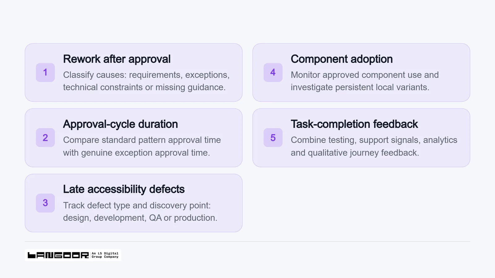
Use a focused scorecard to assess delivery speed and quality over subsequent releases.
Avoid using adoption as the sole success metric. A system with high adoption can still be bureaucratic if its components do not meet real delivery needs. Equally, an exception is not automatically a failure; it may be the right response to a new customer need. The useful question is whether exceptions are intentional, evidence-led and reusable when proven.
FAQ: How can enterprise design systems make the next delayed launch your starting point?
Enterprise design systems are not a creative constraint when they are governed as a delivery tool. They protect the quality of the work that should remain consistent, allowing teams to apply more attention to the creative choices that shape customer perception and commercial outcomes.
Start with one recently delayed launch. Identify the three decisions that were repeatedly re-litigated - perhaps form validation, CTA hierarchy or page structure - and make them the first candidates for a governed library. Then define the owner, usage rules and review gate for each one.
Langoor helps enterprises connect strategic innovation, customer experience and data intelligence across complex digital programmes. To explore how a more coherent design and delivery model could support your next launch, connect with Langoor.
You may also like this